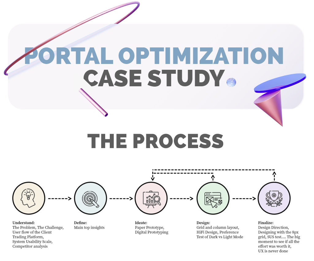
Overview
Redesigned a trading account page to improve usability, reduce friction, and support better decision-making.
Role: UX/UI Designer
Timeline: 3 weeks
Focus: Research, UX, UI, Testing
For this study I was the UI/UX designer that:
Did all the research, was leading all stakeholder meetings, did the paper, low and high-fidelity designs. Did all the user testing, did all the UI work, did the prototype, and put up with a lot of push back :-)
Tools used
Figma, Adobe XD, Typeform, Google forms, illustrator, Company BMS, Google analytics, Pen and Paper.
The problem
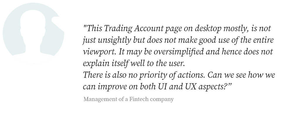
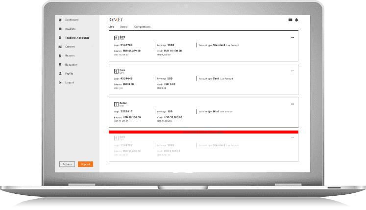
Explanation of what is a Client Trading Platform
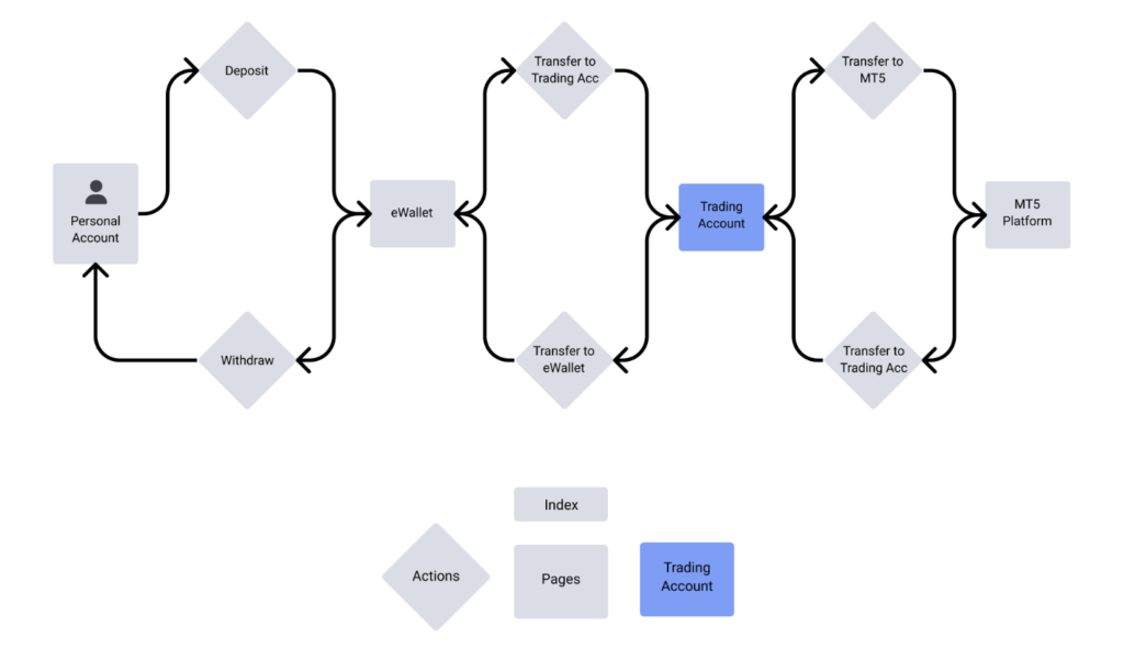
To better understand where the Trading Account page resides, I prefer showing it in the context of a user flow as opposed to in a sitemap. This would better show the before and after actions one could take and further explain its use.
Further actions that can be taken for each Trading Account:
Change Leverage, View Transaction History, View Profit and Loss
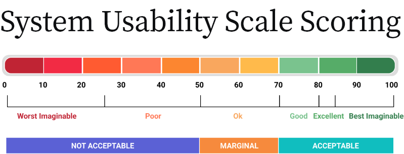
System Usability Scale (SUS)
To measure usability, I conducted a System Usability Scale questionnaire that served both the purpose of seeing how the product measured at this stage and then use this as a baseline score against the new product that I was about to redesign. The questionnaire was done with 10 users which already had some prior knowledge of how a client trading platform works.
But what is a System Usability Scale?
This is a standardized ten item questionnaire that is scaled and measures the ease of use of the product or in this case, this Trading Account page. This would evaluate the following:
- Efficiency: How fast someone can use it.
- Intuitiveness: How effortlessly someone can understand it.
- Ease: How simple it is to use.
- Satisfaction: How much a user subjectively likes or dislikes using it.
- More specifically it would help me know if users could understand the contents of the page and act on them,
(Transfer funds to the MT5 platform or back to their ewallet, make a deposit, change the TA (Trading Account) leverage, view transactions history, or view their Profit and Loss). - It would help me in identifying areas that can be improved.
SUS statements posed to the users
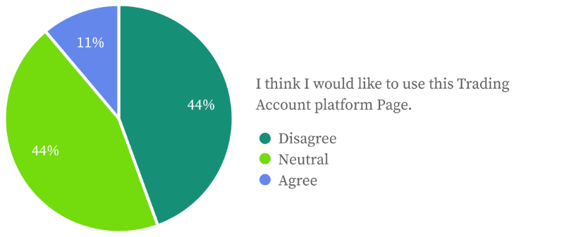
I think I would like to use this Trading Account platform Page.
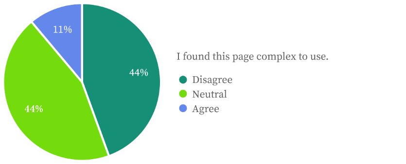
I found this page complex to use.
I thought it easy to use.
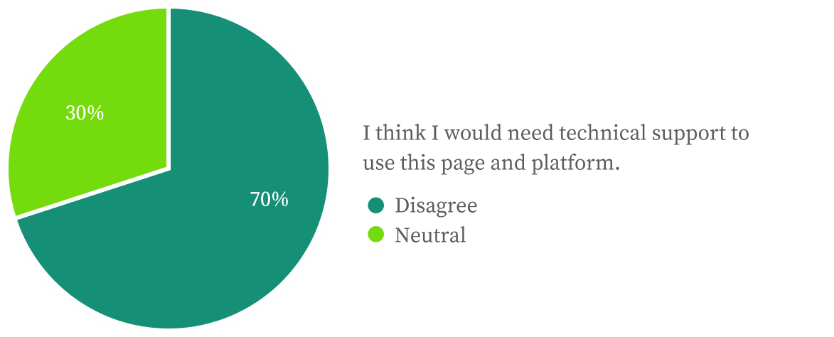
I think I would need technical support to use this page and platform.
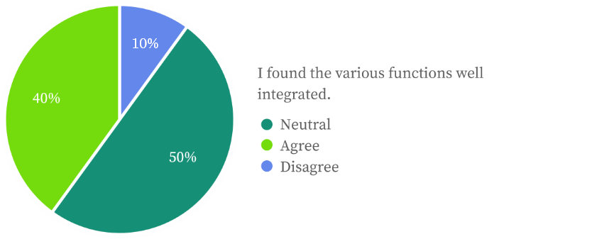
I found the various functions well integrated.
There is too much inconsistency here.
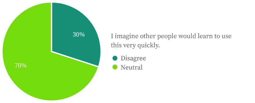
I imagine other people would learn to use this very quickly.
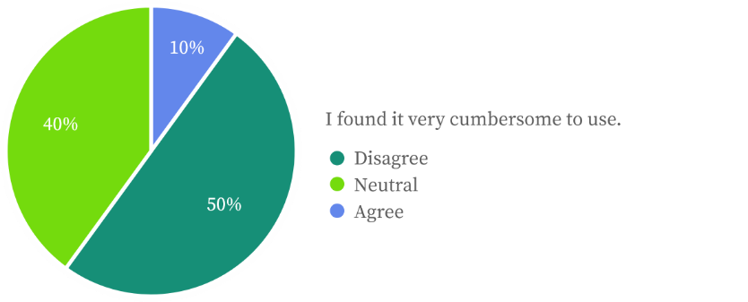
I found it very cumbersome to use.
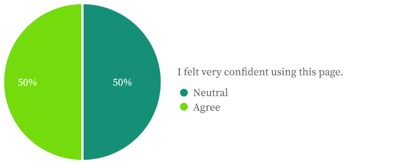
I felt very confident using this page.
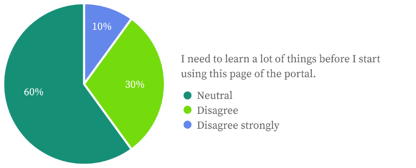
I need to learn a lot of things before I start using this page of the portal.
Bellow is a SUS index:
SUS Methodology and the score
The questionnaire was sent to 10 users that fitted the user base demographic. All confidentiality protocols were followed. I am acutely aware that the score confidence level increases in proportion to the number of users.
I used the online survey software, Typeform, and sent the link to each user. The software allows all results to then be exported as a XLSX format that makes data manipulation easier.

Results of the SUS

Competitor analysis of the Trading Accounts page
Not every of these competitors followed the same architecture or general business plan but bellow are some of the ones that resembled our own Trading Account page. The objective was to look for any innovative ideas that we could adopt or improve on.

Exness. Clean layout without much to distract the user of their main tasks. I would reconsider some of their labels and use of icons. I think their account cards are of the right size and well worth adopting.

Plus500. The portal was used mostly as a wrapper to the MT5 platform with only some limited control over the user profile and settings.

FXPro. Very well thought out page with uncomplicating content that leads the user to all the necessary actions. The view options are limited to list view which does not make optimum use of the cards on desktop view.

CMC Markets. Like many others in the industry, their portal is a MT5 Wrapper aimed at trading.

Tiomarkets. Good use of responsive design albeit an outdated UI. The user experience may be a little confusing with the variety of coloured CTAs all asking for attention. The list view of the accounts is congested.

TMGM. An archaic style of design that is more of a report than a quick snap view of the accounts. If there are many accounts, this page of theirs will get very busy.
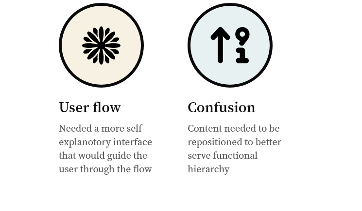
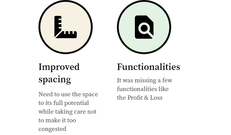
Main top insights gathered from the SUS and the Analysis

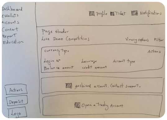
Paper Prototype
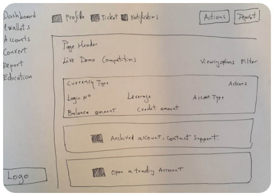
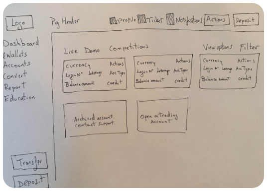
As a starting point, paper versions were initially done to study all the different possible layouts and start an initial conversation over actual designs. With each meeting with the Stakeholders, I kept iterating the designs. Here are the 3 main iterations.
Feedback 1
It made little sense to have the Profile, Ticket and Notifications in such a primary position.
The Deposit and Actions needed more attention.
Feedback 2
The page header was not positioned well with poor use of vertical space. The logo was also thought to being compromised. Although the Transfer link could live in the actions, it was still felt that it was important enough to live somewhere more visible. Also, the list views of the accounts, did not make good use of space and only encouraged endless vertical scrolling if there were many account.
Digital Prototyping
I needed to share the final iteration of the wireframes, so a digital wireframe was circulated to the SHs and a *Test group of 9 users.
*Test group. Taking into account from our top 20 clients, I took the main demographics of age (average of 33) and status (single), and I loosely created a test group of 4 people within the company and 5 users that the client support found for me, that reflected our users.
The main task given to the test group
With a good understating of a client’s journey through the portal and onto this page, the test users were asked:
1) Does this show all the necessary account details? 2) Would you know where to deposit, transfer, open an account and start trading?
Main insights
I needed to add a bit information in my upcoming HiFi design, and this would bring us to a more final product with actual content and the UI to support it.
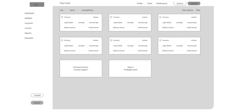
Grid and column layout
Before starting a HiFi design, an initial conversation and agreement with the developers led me to set up, the foundation of the design.

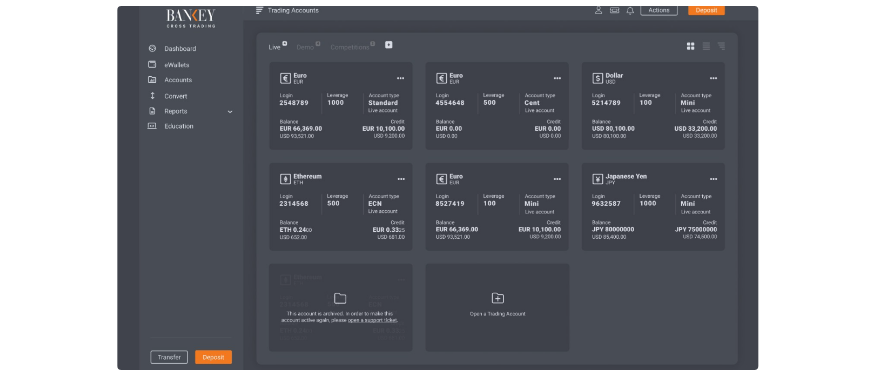
HiFi Design
Having a good idea of content, I now proceeded to create a HiFi design in light and dark themes at actual size and ready for viewing.

Preference Test of Dark vs Light Mode
1. Using google forms, it was easy to quickly establish a light or dark theme preference.
2. 6 out of 9 preferred the dark theme as the main default UI.
3. It seemed like a landslide decision with the 3 that chose white, still not sure about their choice and commenting that the darker version seemed more modern.
Design Direction
The design direction was taken from the new brand direction which I helped establish.
After the AB preference test, I went with the unconventional option of using a dark theme as the default. Most clients use their MT5 platform set to a dark theme and so I thought having the platform too in a dark theme, would contribute to a seamless user experience. Another contributing factor was that it tied in nicely with the company’s brand. The user however, could choose a light theme from his profile > settings.

UI Kit / Design System
The UI kit here which is a library of all the design elements used for consistency when building the new look, successfully demonstrates the modern and clean look I was striving for.

Designing to a grid
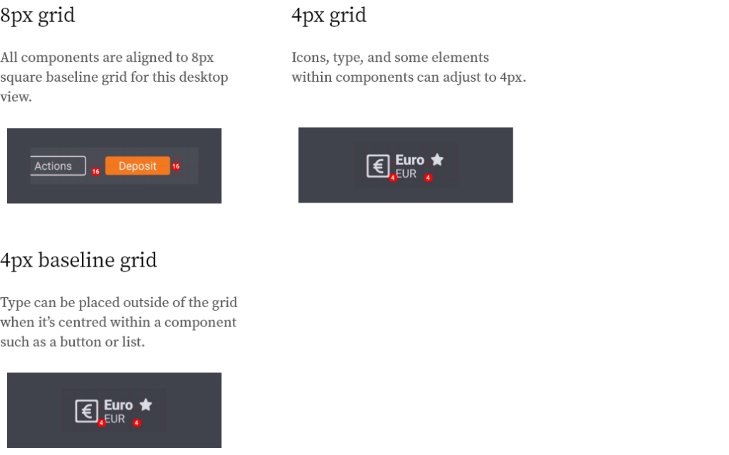
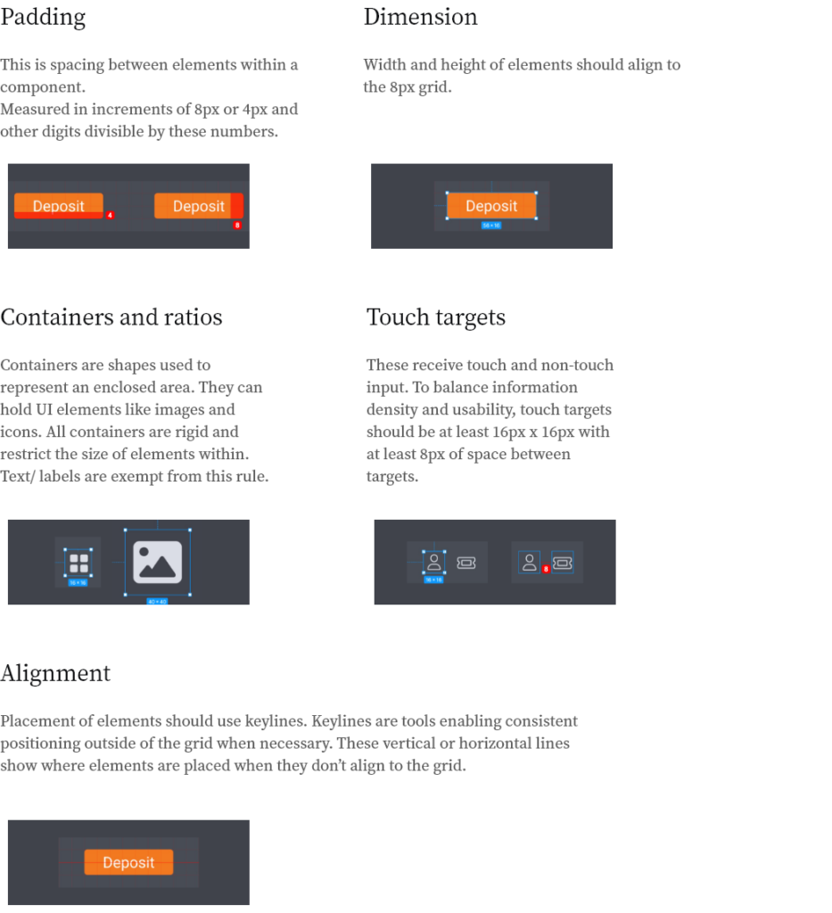
Spacing rules on element placement
How the platform was further refined


SUS test…. The big moment to see if all the effort was worth it
To validate the redesign of the interface before its live release, the same System Usability Scale questionnaire was done with the same group of 10 users 3 weeks after their 1st SUS. Ideally I would recommend doing the test with another group of similar demographics so as to overcome any biases from the 1st SUS test. Again I used Typeform and all the same confidentiality protocols were followed.
This would help evaluate any improvements on the following:
- Efficiency: How fast someone can use it Intuitively: How effortlessly someone can understand it.
- Ease: How simple it is to use.
- Satisfaction: How much a user subjectively likes or dislikes using it.
- More specifically it would help me know if users could understand the contents of the page and act on them,
(Transfer funds to the MT5 platform or back to their ewallet, make a deposit, change the TA leverage,
view transactions history, or view their Profit and Loss). - Helping me in identifying areas that can be improved
This is a good score and certainly an improvement on the previous test. I would like to be honest and admit that I expected a better performance, but I and the stakeholders were happy with the outcome.

Thank you.
Contact details:
Cyprus Mobile 00357 99770409
eMail sergio_madureira@outlook.com