

Better Modals
Creating consistent user flows through a scalable design system.
At first glance, they were just modals.
But across the product, they had quietly become tiny pockets of inconsistency, different spacing, different typography, different button treatments… and occasionally, different user experiences altogether.
Example was what they saw when they registered, to the quick pay modal and to other basic modals in main flows.
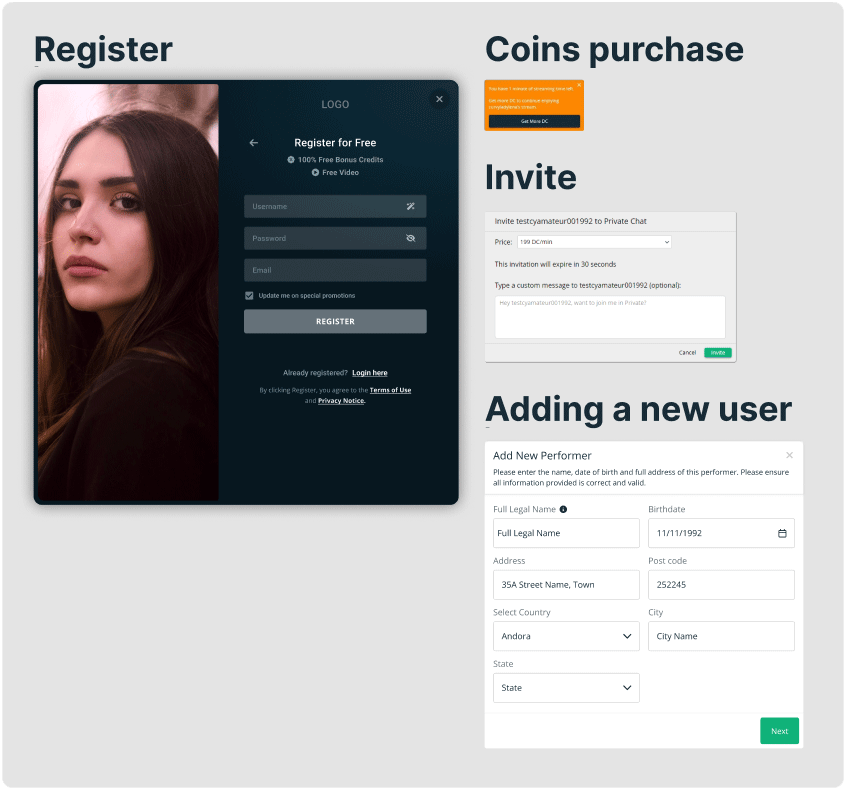
Screen grabs of the same product with different modals.
Why it mattered
-Broken visual consistency
-Eroded trust/confidence
-Increased cognitive friction
-Flows feel disconnected
-Accessibility inconsistencies
Research & Key Findings
A key consideration throughout this work was our predominantly 40–50 age demographic, many of whom relied heavily on clarity, predictability, and visual consistency when navigating the platform. In high-focus journeys, particularly registration, payment, and account-related flows. Even small inconsistencies in modal behaviour, typography, spacing, or button placement had the potential to create hesitation and uncertainty. What may seem like minor UI differences can quietly impact a user’s confidence in the product experience.
We also recognised that friction at these critical touchpoints can have a measurable business impact. Even modest hesitation during onboarding or payment can contribute to weaker progression from registration to first purchase and, ultimately, lower rebill rates. While the modal redesign was one part of a broader optimisation effort, improving consistency helped reduce unnecessary friction at key conversion points and supported a more trustworthy user experience.
One important observation was that inconsistent interfaces are often interpreted by users not as a system issue, but as a personal mistake. A modal that suddenly looks or behaves differently can trigger thoughts like, “Did I click the wrong thing?” or “Did something go wrong?” For users already navigating sensitive or transactional tasks, that extra layer of doubt increases cognitive load and can erode trust. Creating a more unified modal experience was therefore not only a visual improvement, but also a usability and confidence-building initiative.
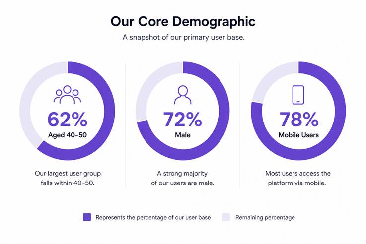
Common Issues Identified
-Inconsistent modal widths
-Irregular spacing and padding
-Weak visual hierarchy
-Unclear button emphasis
-Different close behaviors
-Typography inconsistencies
-Mobile responsiveness gaps
-Accessibility concerns
Accessibility Considerations
Given our predominantly 40–50 user demographic, we needed
-Readability and clarity
-Stronger contrast
-Consistent hierarchy
-Larger tap targets
-Predictable layouts
-Reduced cognitive load
The Solution
As part of helping shape our MUI v6-based design system, I saw an opportunity to bring consistency, accessibility, and trust back into one of the most heavily used UI pattern flows in the product.
Design System Foundations that would help were
-Spacing tokens
-Typography system
-Button components
-Input fields
-Responsive grid behavior
-Color system
-Interaction consistency
To ensure consistency and scalability across the website, I established a modal design system built on reusable MUI v6 components. Rather than designing one-off screens, I created a standardized modal structure using token-driven spacing, typography, and interaction patterns that adapt seamlessly across desktop and future responsive layouts. This approach enables rapid iteration, reduces design and development effort, and ensures that updates, such as changing an icon, button style, or spacing token, can be applied universally across all modal instances. By aligning modal behavior and visual patterns through a shared system, the experience remains cohesive, maintainable, and scalable as new user flows are introduced.
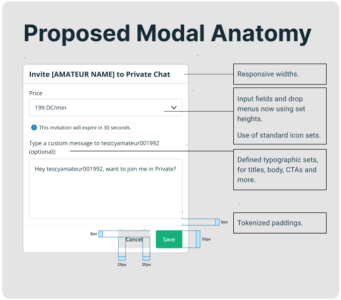
Edge Cases
Error states – Clear validation and feedback patterns help users understand issues and recover quickly.
Buttons and reducing cognitive load – Limited to a maximum of two CTAs per modal to support faster decision-making and prevent choice overload.
Scrollable content – Internal scrolling accommodates longer content while maintaining context and preserving the page state behind the modal.
Consistent interaction patterns – Standardised layouts, spacing, and actions create a predictable experience across all modal types.
Break points – Multiple break points for when content needs to be shown horizontally.
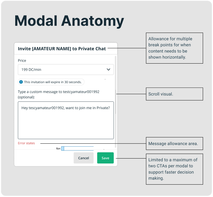
Implementation Strategy
The Challenge
A full modal overhaul across the platform would have required significant engineering time and risked disrupting active product work.
The Strategy
Instead of a sweeping redesign to all modals, our strategy was simplified to:
-Prioritize high-impact flows. Registrations and payment flows
-Roll out incrementally
-Start with payments
-Create adoption guidelines for future work
Outcome
-We established a scalable modal standard
-Improved consistency across key flows
-Created a stronger foundation for future UI work
-Increased alignment between design and engineering
-Reduced ambiguity for future modal creation
-Future modals now had a blueprint