For this study I was the UX/UI designer that:
Conducted all the research, was leading all stakeholder meetings, did the paper, low and high-fidelity designs. I also performed all the user testing as well as all the UI work and did the prototype. Then I gave myself 2 days holiday 🙂
Tools used
Invision, Google Teams, UXTweak, Google Forms, Company BMS, Pen and Paper, Adobe Illustrator, Adobe XD.
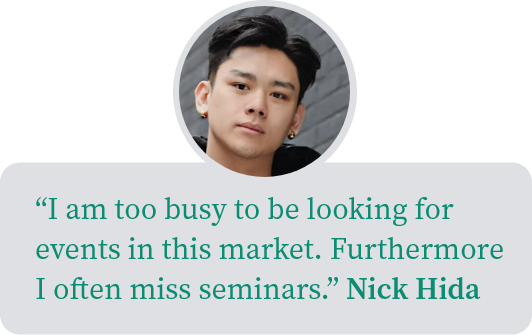
The problem

The challenge
To confirm this statement is true, and if so, to then create a seamless forex event attendance flow.
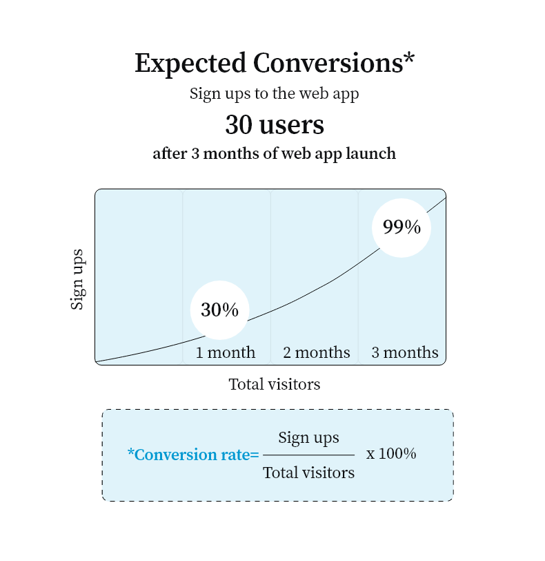
How will we measure success?
Three success metrics based on the AARRR framework were agreed with our PO (Product Owner). The bellow metrics were defined in detail by the business analysts with expected time frames and user actions in mind. I now had target numbers.


Why not use a SUS Score?
It was definitely a user test that I could of conducted but management were not as user-centric as I was and insisted on performance metrics instead that I could be held accountable against. It was justified to me as something that could be conducted at any time.
Guerrilla Research
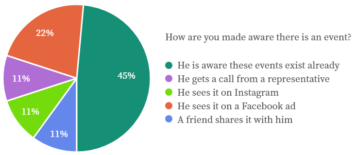
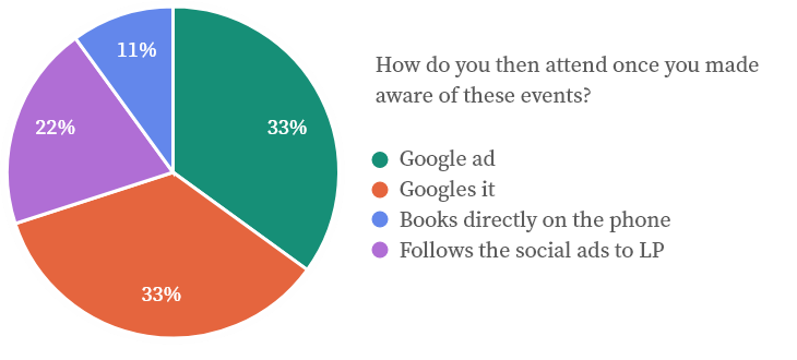
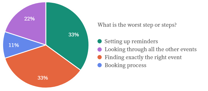
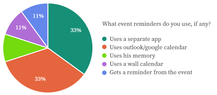
Quick 10 min chats with 4 user support colleagues at the company regarding how their users were made aware of upcoming events revealed 3 observations.
Methodology: A casual cup of coffee, some open ended questions about how traders were contacted, how traders found events and if any marketing efforts were made to advertise events. In the spirit of doing casual research, I recorded everything with pen and paper.

Competitor analysis
Understanding what direct and indirect competitors did well and not so well would shed light on this project. Many websites and apps out there do certain parts, but not the entire flow.
Features analysed for competitive analysis:
1. Finding a forex/ crypto event
2. Booking an event
3. Scheduling an event
4. A reminder mechanism
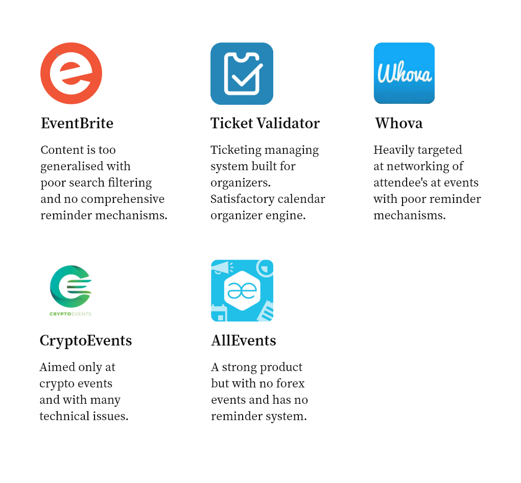
Conclusion – Most of these products have elements of event finding, but not the entire flow that suited a more user-centric approach. For example most had a way to find the events albeit it missed on some key information like who was the host. Few if any, had proper inbuilt calendar or reminder mechanisms.
How could I give value to our app?
Another huge improvement on any competitor would be the way that I would bring all the elements together for a one solution product. The user would be able through a comprehensive search engine, to be served with relevant information. The content would be extensive without being bloated. The process could be a simple one-book system that if signed up, would automatically synchronize with all and any calendars. A robust reminder system could be explored, with push notifications as reminders, emails and system reminders while not being too intrusive. By borrowing some aspects from competitors, I could build a product that addressed the whole event flow in a seamless way.
Further exploration
Some extra key findings that enforced the creation of a web app (not a native app in our case), and the promise of more future events, gave extra justification to this product.


User interviews
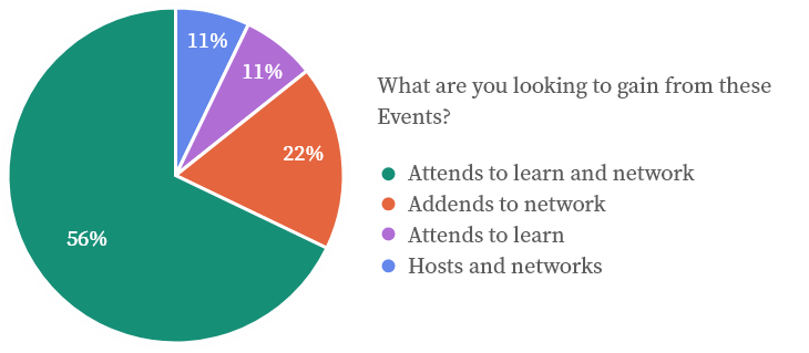
Having established that a central place to find, book and schedule events was now important, I went on and interviewed 9 users based on factual findings that 83% of out top 50 traders were an average of 29 years old and so I targeted this age range. This was done to better understand the process and what areas were problematic or could be improved.
These were online interviews of +-20 minutes.
Data outcome
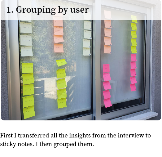
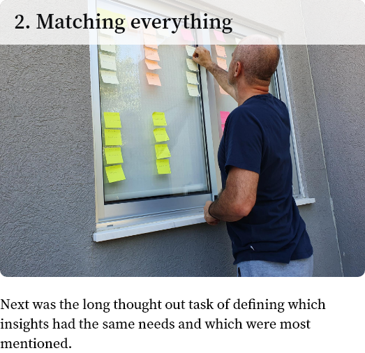
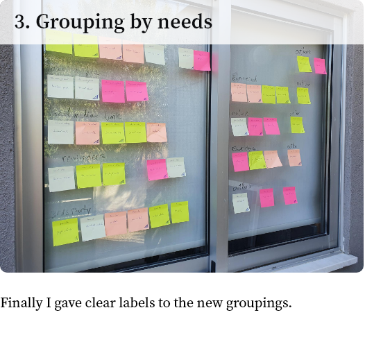
Affinity mapping
How did I know which of these were related and how could I group them to better define actionable insights. To answer this, an affinity map was done.
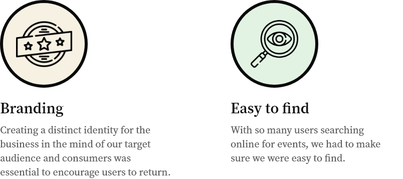
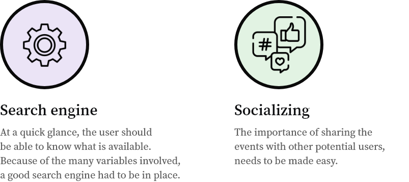
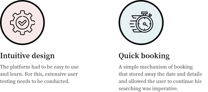
Key insights

Prioritizing based on impact
With all our insights in mind and a clear idea of what challenges we had to do, I needed to prioritise my work.
For this, I used the Eisenhower Decision Matrix.
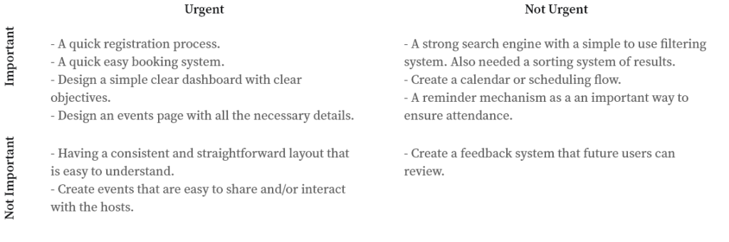
How the Matrix works
Urgent and Important: Features that are the first impression and could deter users from continuing if they cause a negative experience.
Not Urgent and Important: Don’t have to be tended to immediately, but would improve usability and user satisfaction.
Urgent and Not Important: Should be tended to immediately. These features don’t necessarily help users achieve their goal of booking an event.
Not Urgent and Not Important: These features are more like “add ons.” They aren’t necessary, but might increase revenue or the number of total users.
The *GOAL
Finally I had a target in site. There is a disconnect between looking for a forex event, making a reminder to attend and then attending. I now had the goal of designing a product that helps traders and affiliates find, book, schedule and attend forex events in a seamless manner.
Persona 1 of 3
I decided to create 3 personas that represented our users to help me empathize and design a strong user experience.

Age: 33 years old
Occupation: Full time trader
Location: Lives in Indonesia
Status: Single
Biography: Studied psychology but he soon realised that he was not doing what he wanted to do with his life and instead started growing his hobby of trading to full time trading.
Frustrations: Has an issue looking through many events online and not being able to have a centralised solution that takes care of the entire event booking process.
Wants: Ideally he should be presented with a few events and have a quick book and scheduling process.
Persona 2 of 3
Age: 27 years old
Occupation: Forex & crypto investing
Location: Thailand
Status: Single
Biography: He was always good with numbers and thinking fast on his feet, so the forex and crypto world was the only exciting place he wanted to be.
Frustrations: Does not like dealing with all the logistics that go into finding and arranging to go to events, even when they are online.
Wants: Just need a quick solution so that I can focus on my trading.
Persona 3 of 3

Age: 26 years old
Occupation: Trader
Location: Japan
Status: Single
Biography:
He always knew what he wanted to do. He got his Business Administration (MBA), and after traveling a little he was in charge of the family business’s finances and he now trades
on the side.
Frustrations: He is unable to remember appointments.
Wants: Ideally I should be presented with a few events and have a quick book and scheduling process.
User Journey

Journey Map Scenario: Joseph Kenbrook needs to find an event near him, he is not sure where to start.
Expectation: Easy to find an event nearby.
Expectation: Easy to book.
Expectation: Should have scheduling mechanism (maybe a calendar with reminders of the event).

Search & Event Details Flows
These 2 main flows that are central to the business need, helped dictate the site structure.

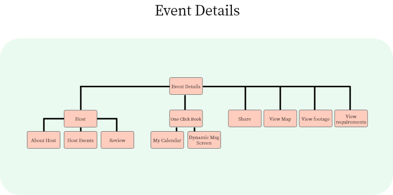
Site architecture
We needed a structure that was easy to learn and use. Hence the choice of a flat architecture that quickly took the user to the end result, as opposed to a deep architecture.

Hub & spoke structure
The Hub and spoke structure served the purpose which was to keep the navigation simple with the 3 main flows accessible, Events on Dashboard, Search and Calendar.

Choosing a product platform
I conducted a research into the many possibilities for platforms. I hence created a matrix table to help me understand which platform would best satisfy *The Goal.
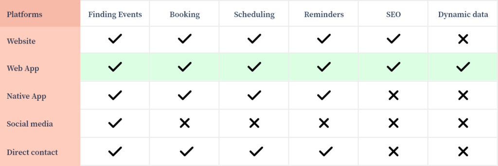
Further advantages of Web Apps over Dynamic Websites to achieve *The Goal
-Delivers a personalized User Experience.
-Can access device features. This increases user engagement.
-Provides uniform and consistent user experience across all the mediums.
-Runs on multiple platforms and devices irrespective of OS — provided the browser is compatible.
Paper Wireframe Iterations
For the purpose of quick iterative work, and start getting something tangible under way, together with the stakeholder, I put pen to paper to soon get feedback. Here were some main iterations.
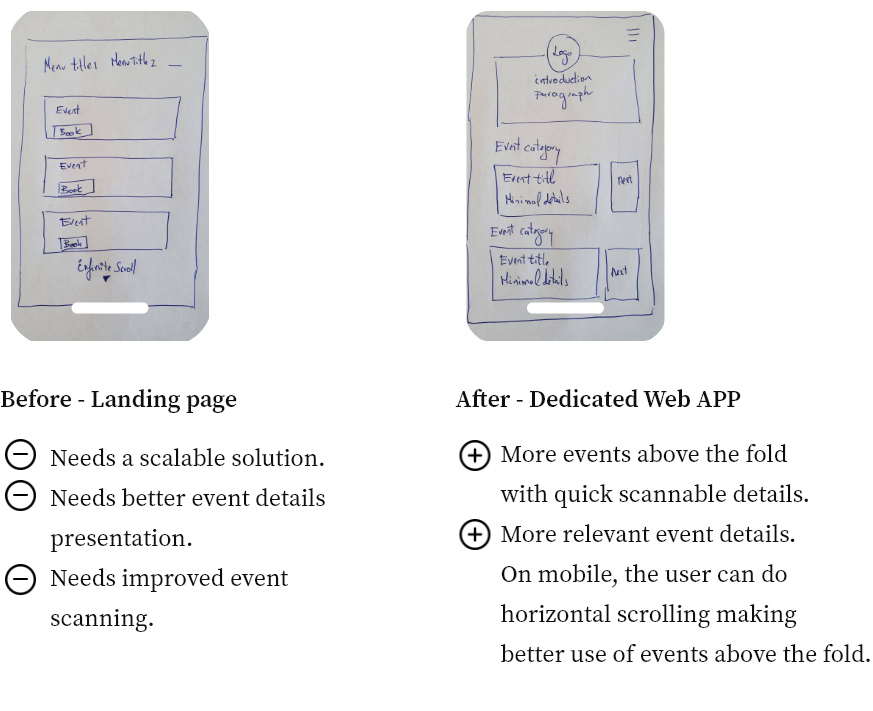
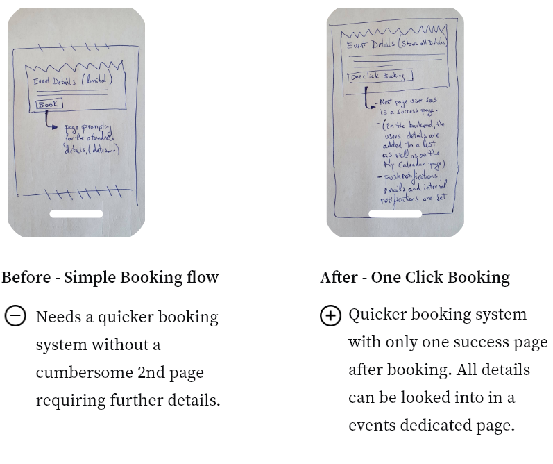
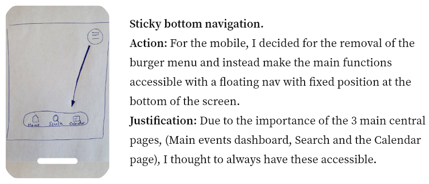
The top right burger menu is repositioned to the centre bottom, for quicker access.
Digital Prototyping
I needed to test that our paper prototypes were validated. Hence I quickly wireframed everything in Invision and gave it to our test group of 9.
Task 1 – Enter details into the registration form.
The top right burger menu is repositioned to the centre bottom, for quicker access

Task 3 – Do a search for events

Task 4 – Do a search for events

Task 5 – Have a peruse around the event details page

Task 6 – Have a look at the calendar

Site Map Testing
A site map was set up and using UXTweak. It was tested using a tree test with my 9 users. There were 2 optimizations.
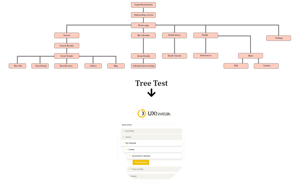
The main optimizations were under the profile link.
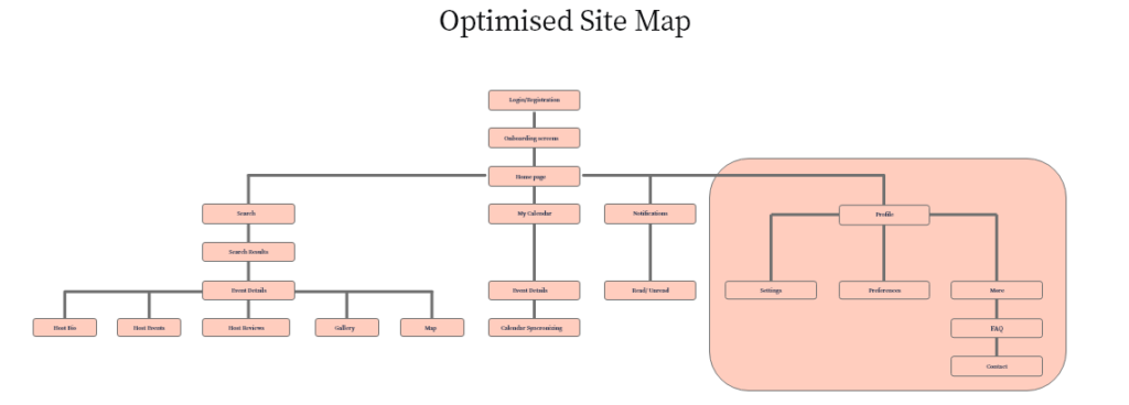
1) Settings: For the sake of a cleaner interface, it was thought better to have the settings under the profile page which research suggested was not an unusual user experience.
2) FAQ and Contact: To cut down on spam and unnecessary emails and better serve the user, we thought to move the FAQ under the more tab.
If the user still could not find help, he/she could then contact via a form.
Design System
The entire system library can be seen in the XD prototype.
A design system that adhered to the present brand was setup with all the basic building blocks;
Typography, icons, buttons, colour pallets, form elements, placeholders.

Colour and Style
The existing brand dictated the core colours and style. The user can change to a light theme in their settings. I did take the opportunity to update a few basics like:


Grid system
Choosing a grid system that performed well on all devices.
The 12 column approach I found worked best across all devices while lending itself to a non restrictive interface design.

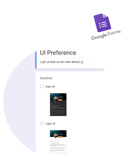
Preference Test of Dark vs Light Mode
Using google forms, it was easy to quickly establish a preference.
8 out of 9 preferred the dark theme as the main default UI.
The 1 user with a slight visual impairment, preferred the higher contrast of the text against white background.
How the platform was further refined


UX is never done
There was a time limit that did not allow any more research and development. Here are a few other areas for improvement.


Conclusion: I felt that I learned that I needed to pay a little more attention to setting correct metrics and not leaving all decision’s to others to make on my behalf.
Thank you.
Contact details:
Cyprus Mobile 00357 99770409
eMail sergio_madureira@outlook.com